Receipt Capture

Design Lead  iOS · Android · Tablet · Web

As design lead of the QuickBooks' Receipt Capture team, I created a tool that digitizes expenses from photos using AI and OCR. It extracts and categorizes details, matching them to transactions and securely storing receipts for easy access.
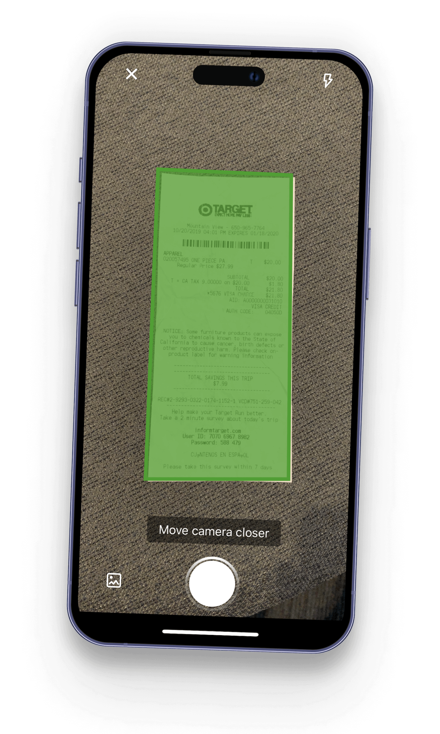
Mockup of the QuickBooks mobile app receipt capture feature, showing a receipt being scanned for data extraction
Design Patent Award 🏅

As part of this work, I invented a new interaction design pattern that was awarded a patent by the U.S. Patent and Trademark Office.

Problem

Receipt chaos
Organzing Receipts is a Struggle

Many business owners struggle to save and organize receipts, often tossing them aside or cramming them into a box until tax season.
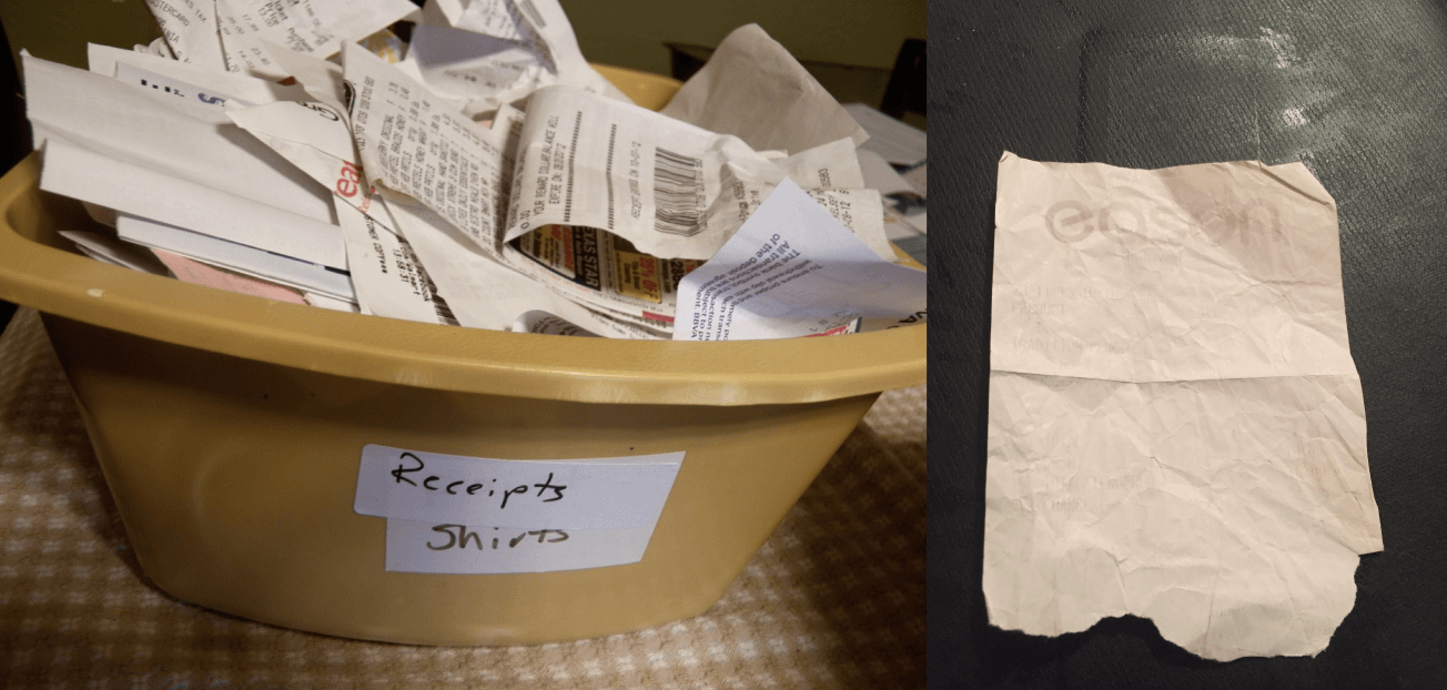
A bucket filled with old receipts, and a receipt with the ink faded away over time.
Piling old receipts and faded ink is a common problem, especially for first year owners
Receipts Can Easily Stack Up

The sheer volume of daily transactions can be overwhelming, making organizing each receipt seem insurmountable.

The Fear of IRS Audits is Real

Tax time brings missed deductions, incorrect filings, and audits. Businesses risk financial penalties, lost credibility, and closure. The IRS demands organized records, and audits can be financially and mentally devastating.

Research

How should it work?
Initial User Research

My journey began with an extensive research phase to understand the depth of the problem. I started by conducting interviews with a diverse group of small business owners from various industries.

I asked detailed questions about their current methods of managing receipts, the pain points they experienced, and the consequences of their disorganization.

Robert Paul on a Zoom call, interviewing small business owners
Interviews with business owners on documenting receipts

In addition to interviews, I also:

  • Distributed surveys to gather quantitative data.
  • Observed businesses in action to see how owners and employees handled receipts in real-time.
  • Immersed our team in the process and user empathy by role playing as a business, documenting receipts and managing business expenses to grasp the frustration and inefficiencies firsthand.
Design workshop participants writing on sticky notes
Organized and led multiple workshops for our team
Research Findings
  • Business owners do NOT want to organize or physically store their paper receipts.
  • Many expressed dread at the thought of sorting through piles of paper during tax season.
  • A lack of time, the tedious nature of the task, and a significant fear of audits were all a common theme.

Competitive Analysis

What receipt trackers are already available on the market?

Before brainstorming solutions, I conducted a thorough competitive analysis to understand the market.

  • Identified Competitors: Receipt management apps including Expensify, Shoeboxed, and Wave.
  • Analyzed Competitor Features: Tested each app, UI & interaction design, data extraction, and software integration.
  • Competitor User Reviews and Feedback: Reviewed user feedback on App Store, Google Play, and forums to understand real-world experiences.

To summarize what was learned, I created a comparison chart of how the competition stacked.

Comparison chart of Expensify, Shoeboxed, and Wave
Insights from Competitive Analysis
  • Receipt capture should be completable in seconds: The quicker and less tedious the feature is, the greater the adoption will be.
  • Automation is Key: Accurate data extraction was crucial. Inaccurate OCR meant more manual corrections, defeating the purpose of the app.
  • Minimize switching costs: Making the feature as convenient as possible for business owers to switch to was paramount.

Prototyping & Iteration

Designing for efficiency and accuracy
Initial wireframing & sketching

I began designing wireframes and interactive prototypes of the app. The initial design featured a simple interface where users could snap a photo of a receipt, and the app would use OCR to digitize the information.

A low-fidelity paper prototype of the receipt capture feature.
Prototyping for real world use cases is essential
A sketch book of low-fidelity sketches of the interaction design of the receipt capture feature.
Many rounds of sketching out how the interaction design should function
User Testing

User testing of the first functional app prototypes was promising but highlighted a few issues. Users were capturing unclear images, making data extraction from the receipt difficult.

An example of a blurry image of a receipt that users were trying to upload.
Blurry images were making it difficult for OCR pull data
Improving Clarity of Image Uploads

To address these concerns, we integrated dynamic user instruction for taking better photos.

A screenshot of the receipt capture feature showing a text overlay that says 'keep document in frame'. A screenshot of the receipt capture feature showing a text overlay that says 'move camera closer'.

Not only did this significantly cut down on blurry image uploads, this delivered a WOW factor to users' first time use.

Getting The "Accounting" Part Right

Catching all possible use cases for how the receipt could make it into a businesses' books was a prolific task that required a huge team effort to conquer. Finally, we had a hardened end-to-end user flow that covered the full breadth of all scenarios.

User flow diagram: Every use case and edge case accounted for after testing

Shipped solution

From receipt to QuickBooks in 5 seconds

After several iterations, we finally developed a polished version of the app. The user experience proved to be intuitive, making it easy for QuickBooks users to capture, review, and manage their receipts with minimal effort.

Push Notifications with Customer Value

I pushed for not bombarding users with trivial push notifications, as this is incredibly important to avoid alert fatigue and users' disabling app notifications.
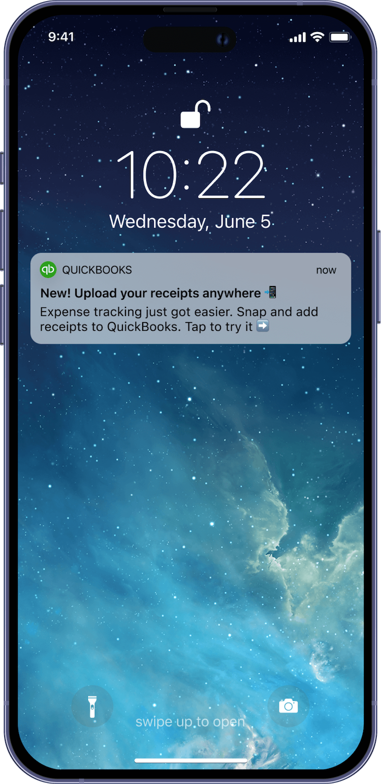
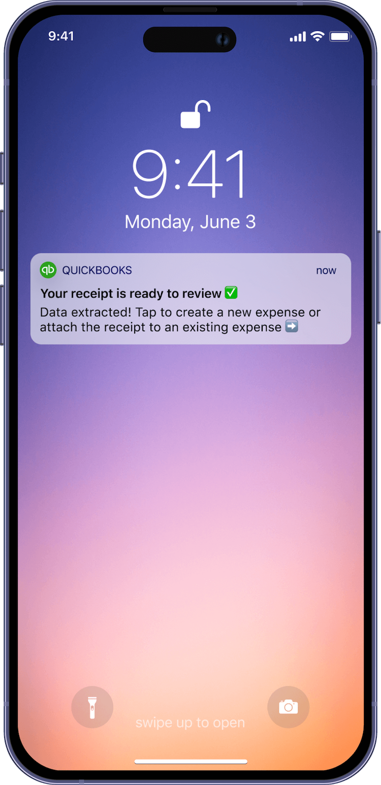
A mockup of push notification saying 'New! Upload your receipts anywhere'. A mockup of push notification saying 'Your receipt is ready to review'.
Entry Point to Feature

Since receipt capture is one of the most important and unique features to the QuickBooks app, the feature had to be immediately discoverable.

Receipt capture accessible from initial app open
Capturing the Receipt Image

After the receipt is captured, the image is cropped to make a cleaner image for later use and archiving.

Receipt image is precisely cropped
Confirming Upload of Receipt Image

After confirming, the receipt image is immediately processed for data extraction and automatic expense categorization.

Image is pre-uploaded for faster processing
Adding Receipt After Data Extraction

When the user comes back to the app, the receipts and their deduction amounts are shown for final user review and attaching the receipt.

The receipt now becomes an expense in QuickBooks

Launch & Impact

The most marketable QuickBooks app feature in years
Go-to-Market Strategy

Collaborating hand-in-hand, our marketing team developed a powerful go-to-market strategy for acquiring new customers with the receipt capture feature.
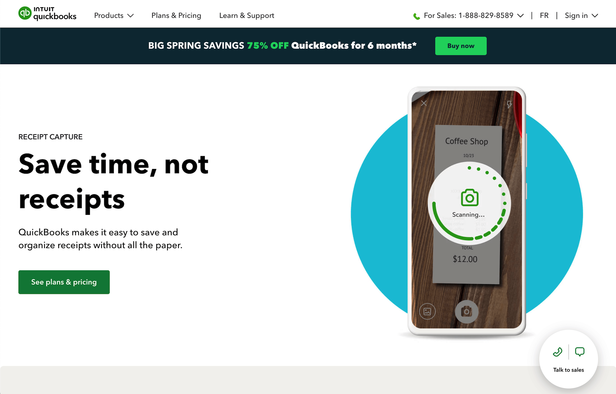
A screenshot of a marketing landing page for the receipt capture feature.
One of many dedicated marketing pages for the receipt capture feature
Cross-Channel Promotion

We leveraged multiple channels including email marketing, social media campaigns, influencer partnerships, and in-app notifications to maximize reach and engagement.

Metrics & Performance
  • Speed of Data Extraction: 8 seconds compared to 30+ minutes for competitors.
  • User Engagement: 68% of daily active users engaged with the feature within the first month of launch.
  • Conversion Rate: The feature contributed to a ~4% increase in subscription conversions on the App Store and Google Play Store.
  • Retention Rate: We observed a ~3% reduction in app subscription churn 3 months post-launch.
  • User Satisfaction: In post 3 months after launch, no harm to 4.7/5 rating on App Store and 4.1/5 rating on Google Play Store.
Return to Main Page