I led design and wrote production code for a responsive sidebar help feature that lets QuickBooks users access help content and complete tasks simultaneously.
Saved Intuit $31 million annually in support costs
Reduced subscription churn by 2%
Preview of solution: Fully responsive sidebar implementation of the help feature
Problem
Users can't view help content and use the product at the same time
Problem Discovery
Unmoderated user tests revealed a major issue with the help experience. The help feature obstructed users' ability to view and complete tasks simultaneously.
Impact on User Experience
Opening the help feature blocks key interface elements needed for tasks.
Here is the button to "Create a rule" in QuickBooks
But the help feature completely covers up the button
This means users can't actually do what the help articles are telling them to do to complete their task.
Financial Stakes
Intuit loses $125M annually because customers can’t figure out how to use QuickBooks.
Research
Observational research for the win
Identifying the Pain Point
During research, I discovered that QuickBooks users were wasting valuable time accessing the help feature. My unmoderated observational research showed business owners were repeatedly opening and closing the help window to understand new features which disrupted their workflow.
Observational analysis of user behavior was key in the design process
Presenting to Leadership
I presented these findings to the VP of Design, Director of Product, and PM of the help feature. Leadership realized the company had invested heavily in developing extensive help content, but users couldn't actually access it efficiently. This gap was preventing the expertly developed materials from achieving their intended impact.
Leadership's Response
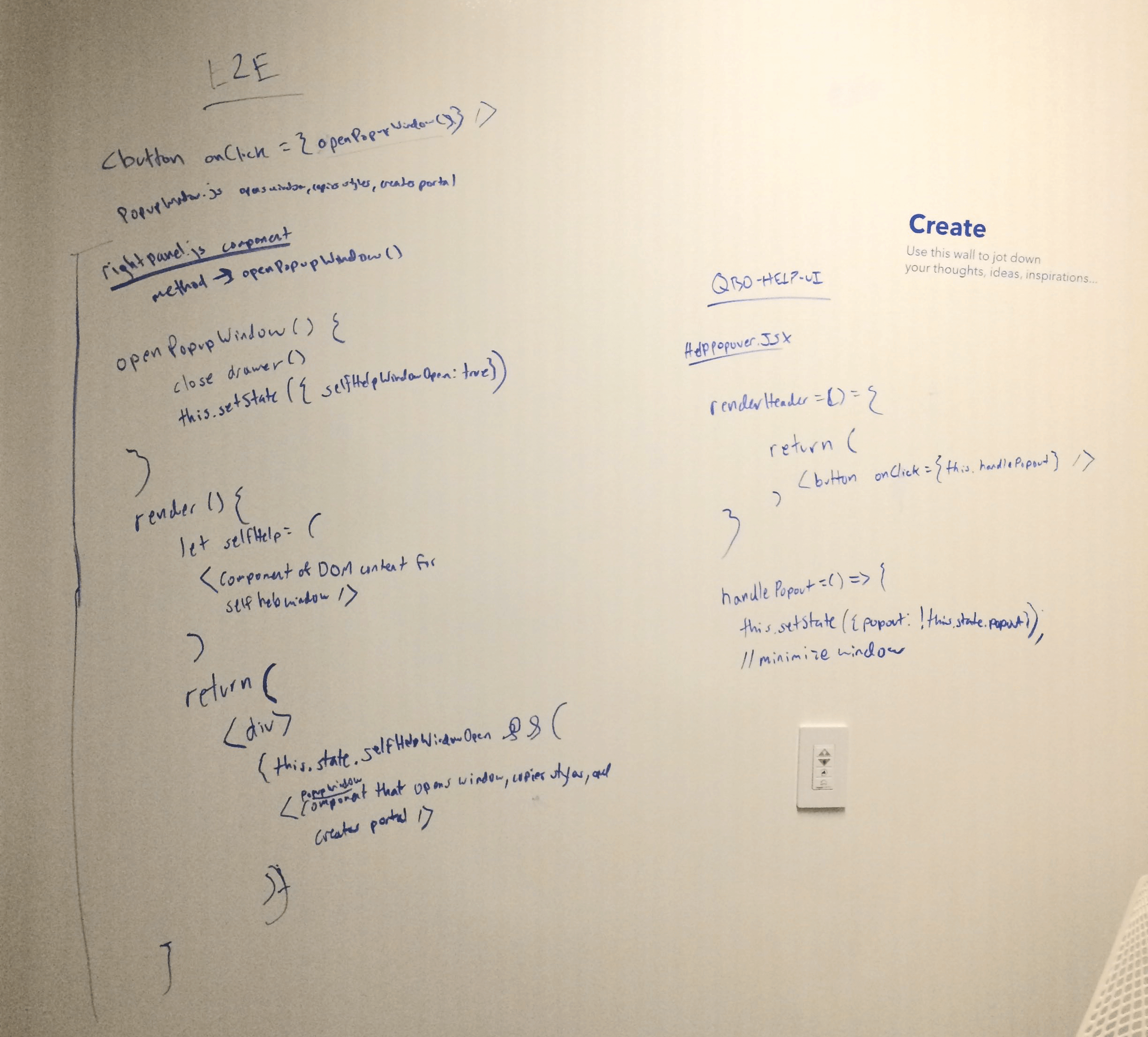
Leadership quickly decided to prioritize the project and remove any red tape. They were committed to ensuring their investment succeeded in empowering users. Given my close involvement and background in software engineering, I was tasked with solving this problem as both a designer and engineer.
Design explorations & user testing
Exploring what all is technologically possible
After sketching, brainstorming, and workshopping a dozen different design ideas with stakeholders to solve this problem, there were only 3 realistic options we narrowed to based on the project timeline and technical constraints of the software.
Design Option 1: Minimizing the help feature
Being able to minimize the self-help window, rather than completely closing it
This solution introduced more usability issues. Users were confused about the minimize button, and those who minimized the help panel had difficulty navigating their tasks.
Design Option 2: Popping out help into a new window
Being able to "pop out" the help feature into a whole new browser window
This new popout window design pattern was unfamiliar and frustrating for users. There was also technical risk as it required a complete re-architecture.
Design Option 3: A responsive sidebar help experience
A fully responsive sidebar interface for the help feature
Users unanimously praised the sidebar option. It allowed them to read help content and complete tasks simultaneously. In real-world use, they appreciated the extra vertical space for help content, making step-by-step tutorials easier to follow.
Technical Challenges
Far more difficult to implement than we hoped
Navigating the Maze of Technical Challenges
Implementing the solution was far more difficult than expected. The QuickBooks product has hundreds of interface permutations. I had to methodically QA test and run multiple moderated user testing sessions of the beta version, fixing dozens of tiny edge cases during a 10% incremental rollout.
Many late nights trying to solve all engineering edge cases
Design Pattern Conflicts
A major challenge was ensuring the help feature worked with the "Trowser" design pattern, a full-page interface required for certain tasks. When opened, the "Trowser" completely covered the help feature, breaking its visibility throughout the experience.
When opened, the full screen "Trowser" completely covered the visibility of the help feature
Shipped solution
Ideal state delivered
Successful Launch After QA
The new version finally shipped with all bugs and edge cases resolved. The responsive sidebar help feature now worked perfectly with existing design patterns, ready for customers.
Before
The help window covers and blocks important interface functionality
After
The help feature now perfectly responsive with all interface permutations
Impact & metrics
Measurable improvements to KPIs
The fully responsive sidebar help experience reduced customer care calls by 22% in the first month, validating the solution's effectiveness.
Customer Satisfaction
Remarkably, there was zero negative feedback from customers after launch, showcasing the feature's effectiveness and matching the unanimous support received during user testing.
Improved retention
Retention rates for new subscribers increased by 2%, indicating a better user experience and easier learning curve for new users.
Savings in Care Support
Due to the reduction in support costs, Intuit saved approximately $31 million annually across customer care calls and live chats.